Niyo's Payment eco-system scaling and App redesign
Interaction DesignProduct ManagementDesign SystemStrategy & Leadership
Niyo Global is India's one of the leading company in forex cards & travel payments. During my 2 year tenure, I led multiple projects across the Payment vertical, Design system, Premium plans, Utility features, Rebranding, UX writing & hiring. Working closely with designers, product managers, engineers & leadership on daily basis.
Niyo UPI
1. Niyo's in-house UPI experience
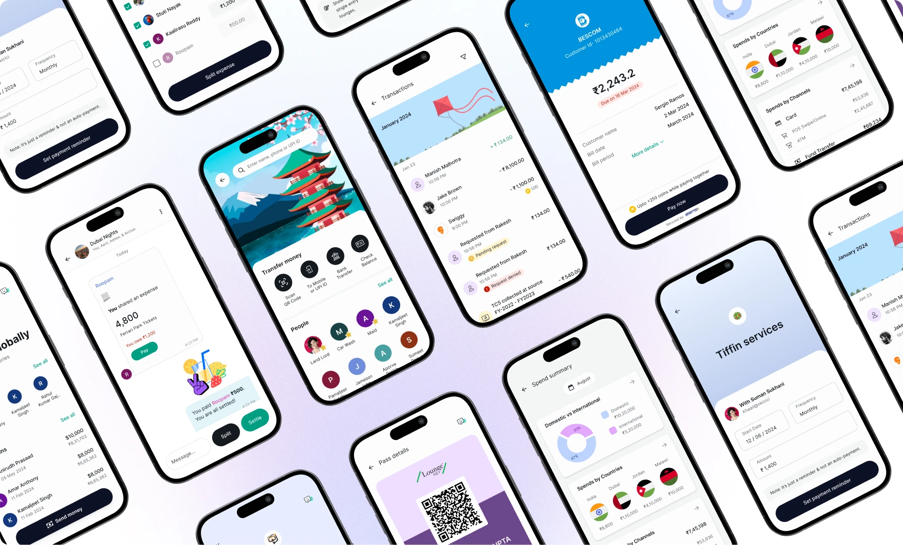
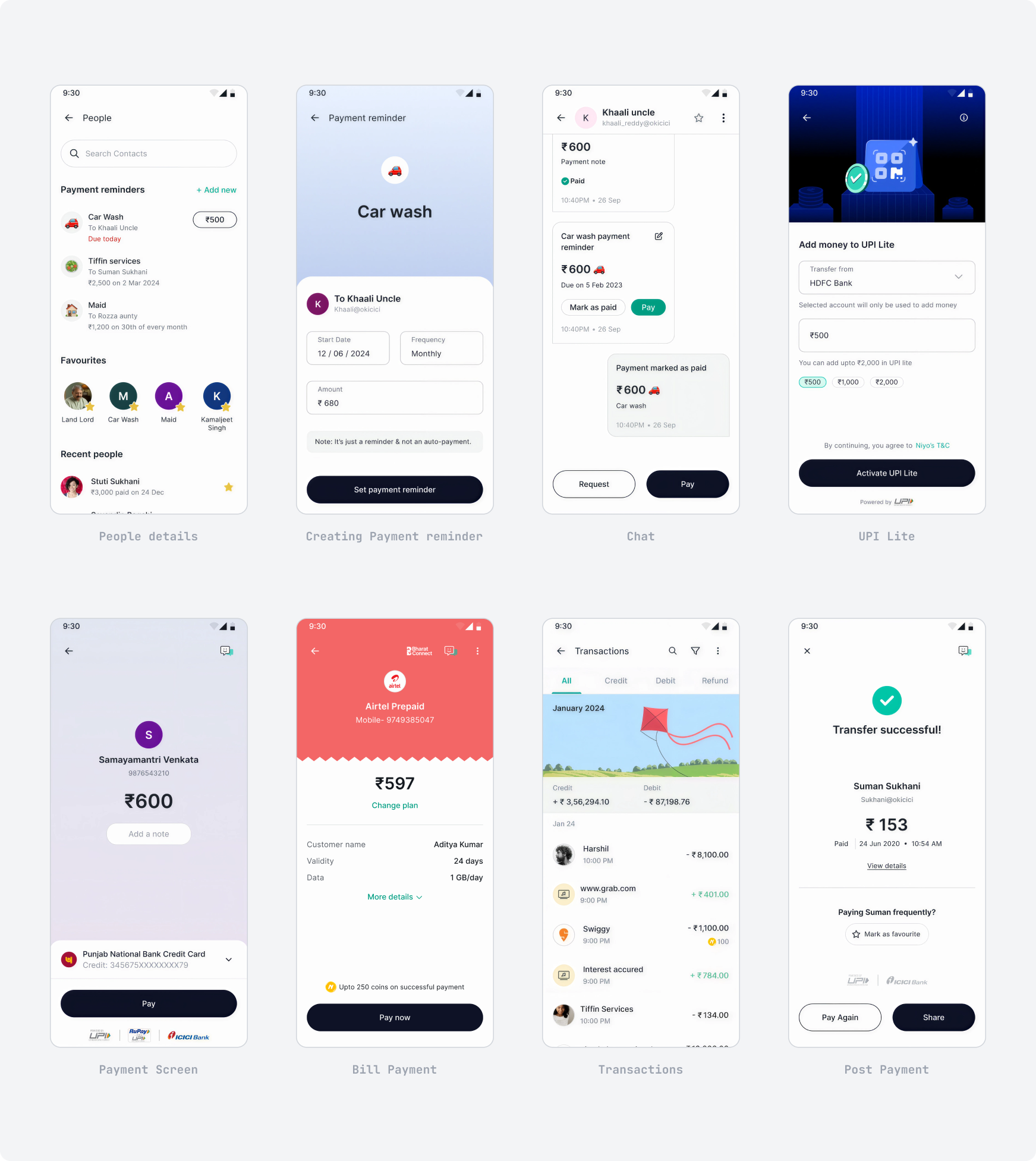
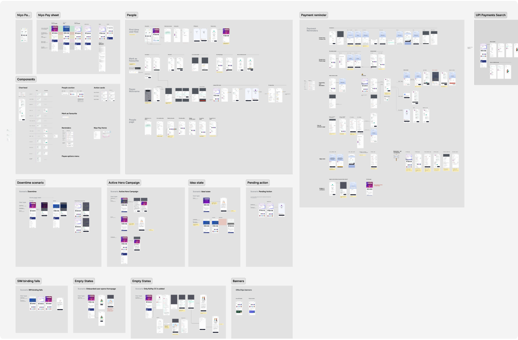
I led the design of Niyo's in-house UPI payment experience from scratch. It increased retention of users in the app for domestic payments, fund transfers to-and-fro from their Niyo accounts & bill payments — one of the most impactful projects I worked on.
The goal was to embed Niyo's travel spirit within the new UPI experience and offer users functionalities missing in other UPI apps they use. This project served as a base for design system and app re-design initiatives.
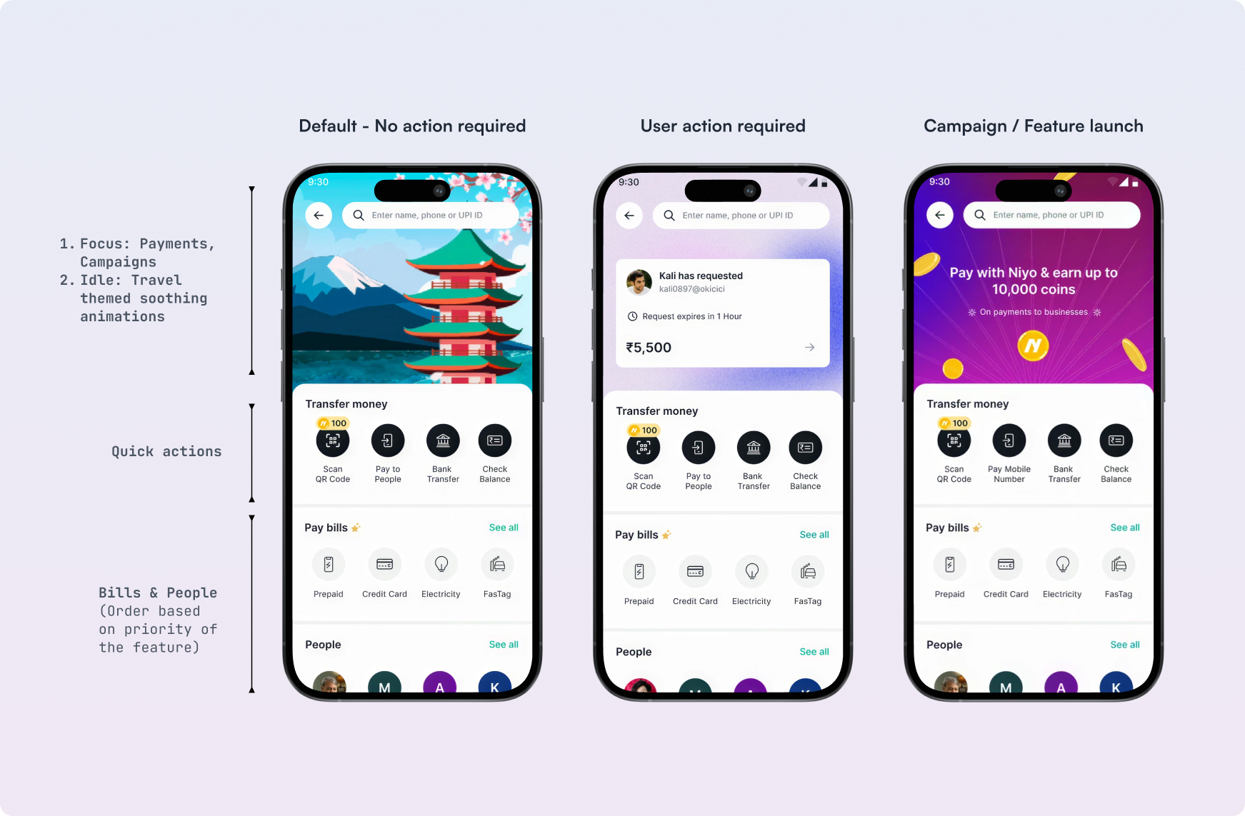
Our key focus was on making the UPI experience more human and natural for everyday life scenarios. Which is why we included features like "Mark a contact as favorite" for frequent payments, and "Add Nicknames" for easily remembering a contact irrespective of their contact or registered name.
Outcome
Impact
- Within 3 months of the launch the UPI crossed 15cr transaction volume.
- 22% of users started paying their credit card bills with the new in-house UPI.
- This was also the first feature release with a launch video — a practice that became common thereafter in the design team.
Remittance
2. A stress-free, intuitive global money transfer experience
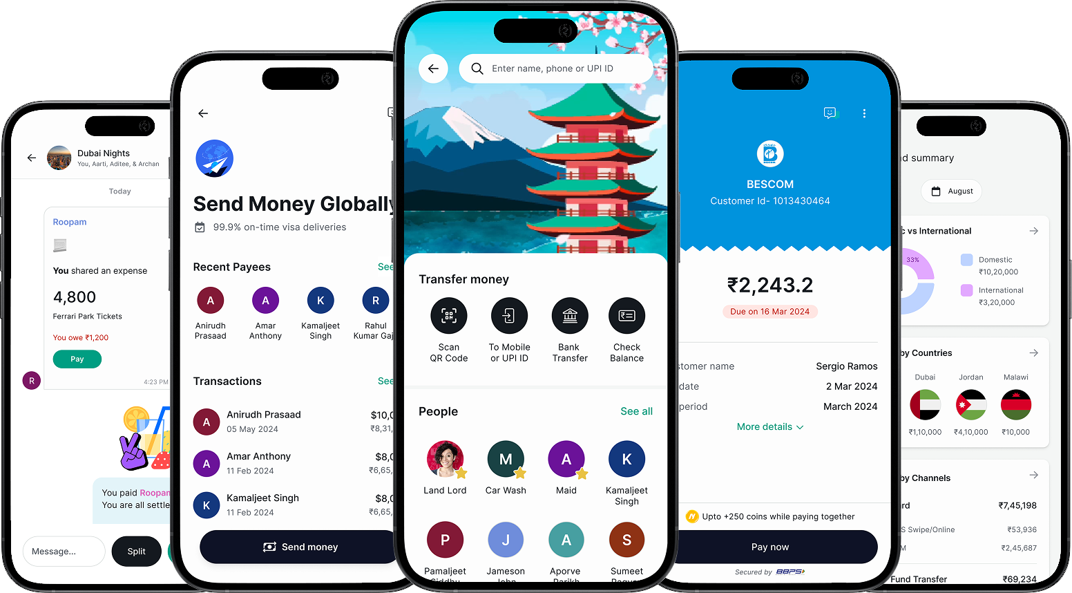
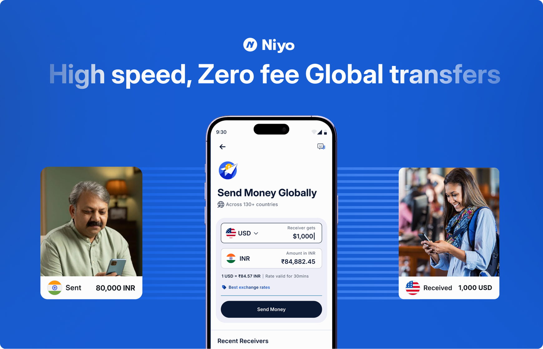
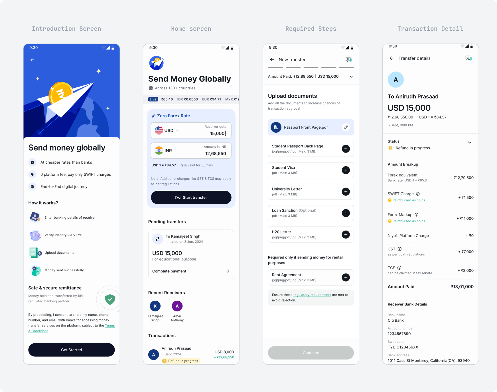
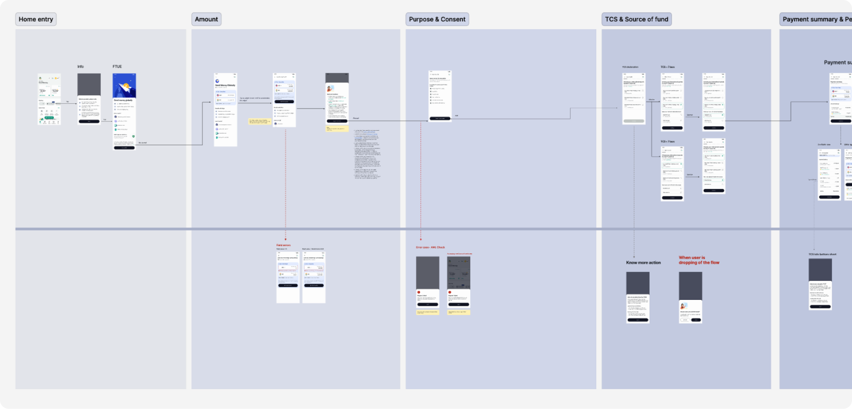
I led design for one of the most important revenue sources of Niyo Global — International Payments. With multiple eco-system constraints, the key focus was on designing a stress-free, clear & intuitive experience for sending money globally to family & friends.
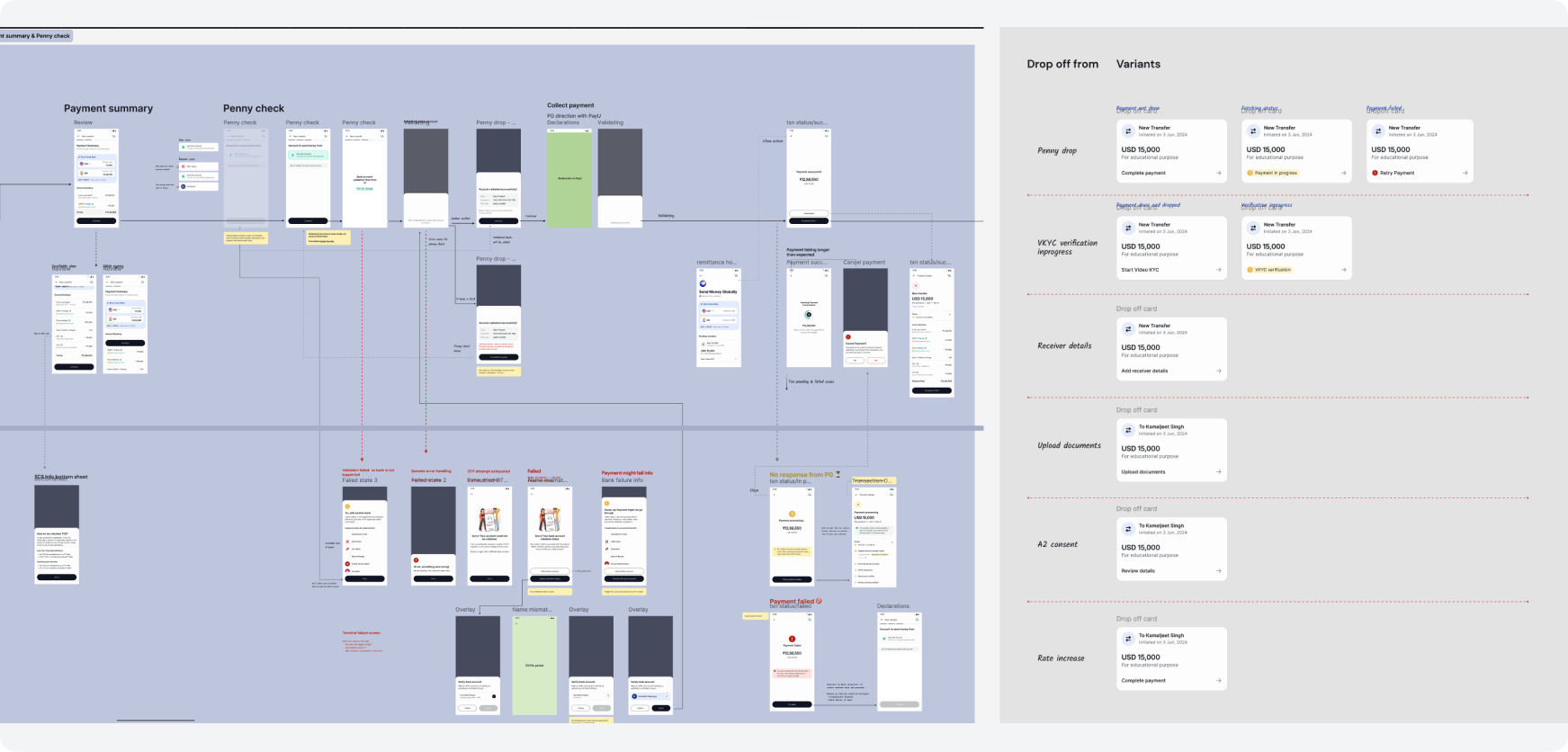
The main challenge was to design for multiple complex approval states within the overall transfer journey, which led to different drop-off scenarios. The home page was designed to allow users to get back in from the last step.
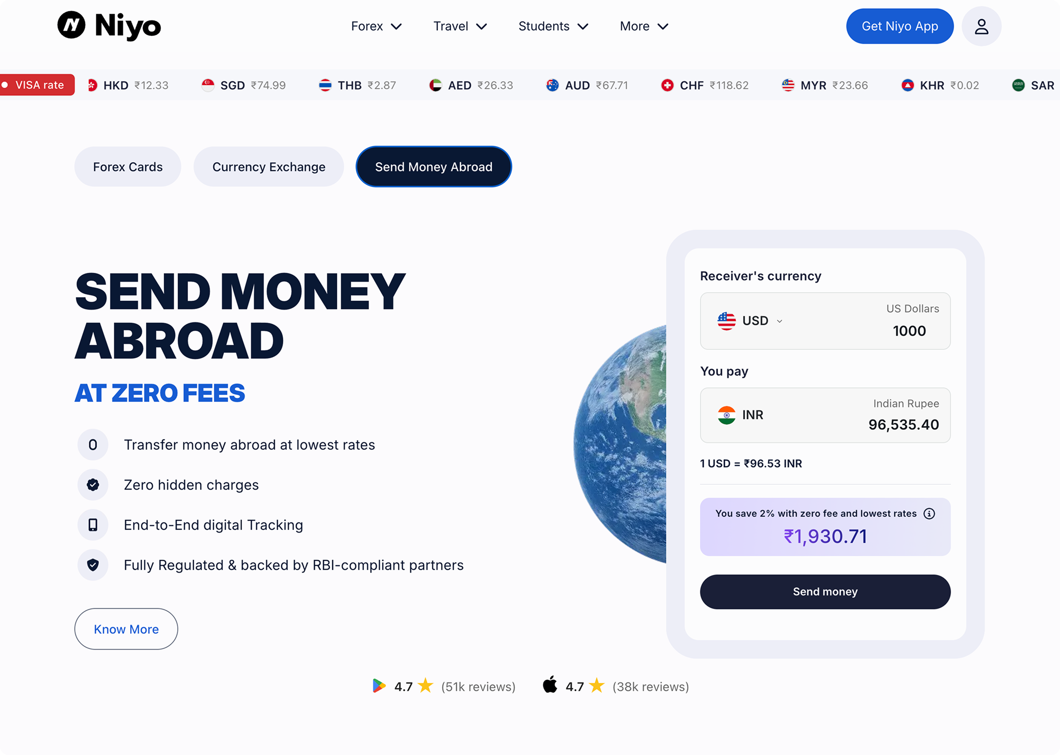
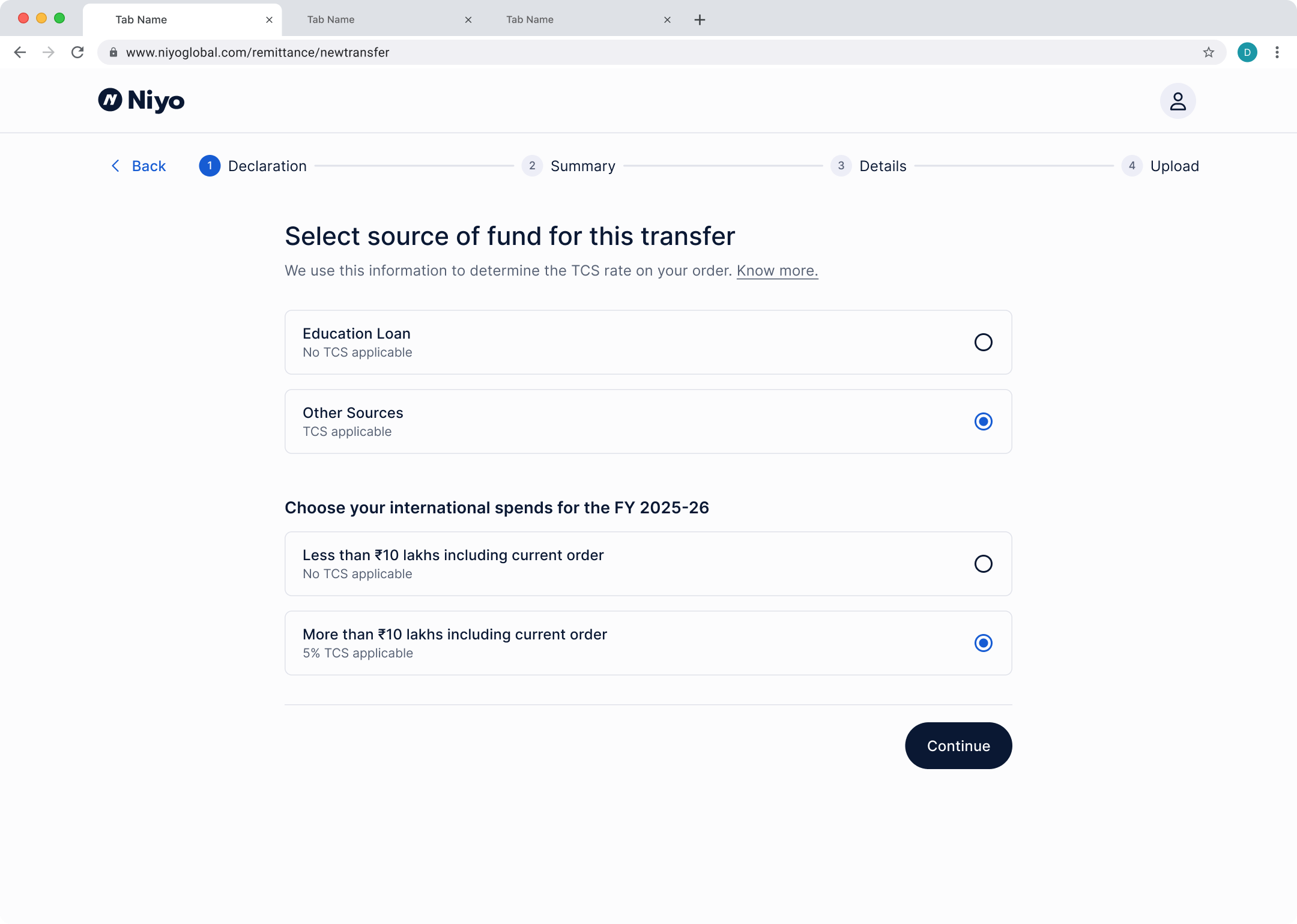
Post-successful launch and adoption on the mobile app, the forex-transfer was brought to Niyo's website as well. Along with junior designer Tushar Prakash, I led this initiative, making the first web-based service experience for Niyo.
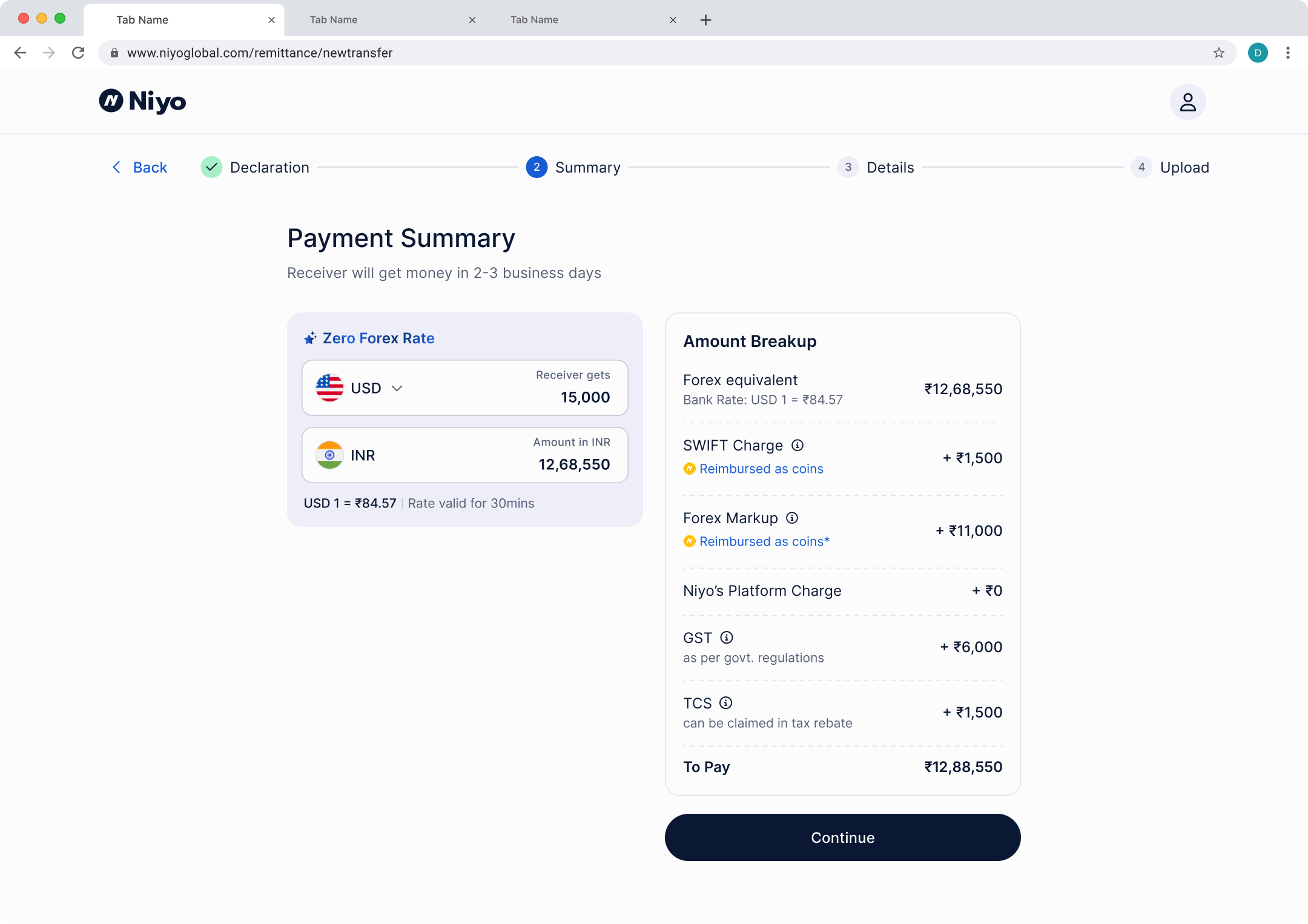
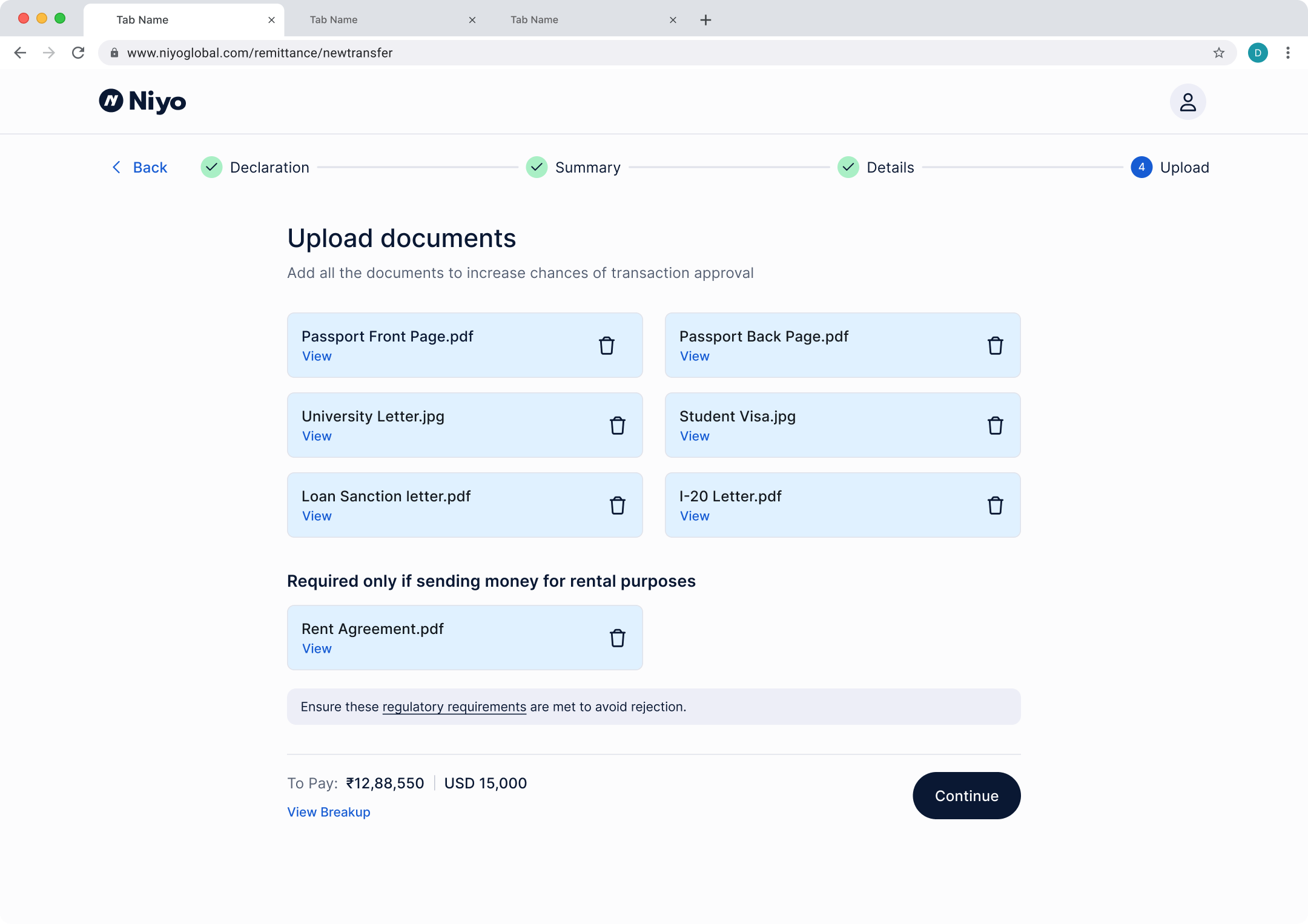
The components, home page structure, error & drop-off handling, and other patterns created in the Remittance project served as a base for the Forex-cash service, which started a quarter after the Remittance launch. This saved major time for both designers and developers since the UI framework was already available — the team was able to focus more on content, logistics, and experience improvements.
Impact
Impact
- Avg. monthly GMV of ₹16cr, with 68% from app and 32% from web.
- Design framework for two of Niyo's main revenue streams.
Niyo Premium
3. Premium plans for high-value users
A yearly subscription plan to grow customer lifetime value, by offering increased rewards on spends, free international lounge access, and savings on services like flight/hotel booking and forex transfers.
Key areas:
- Activation page that supports single to multiple plan selection
- A system for entry points across the app
- Plan offerings and business details with the product team
- Visual identity for the subscription plans

Despite the limited marketing of the plans, within the first month of release 28,381 Premium plans were activated. For new users, 8.2% of them opted for a Premium plan post card order.
With more contextual discovery points and stronger benefits in the future, this conversion rate can be improved.
More details are captured by my team member who worked on the project under my lead — Pragya Goenka in her case study.
Design System
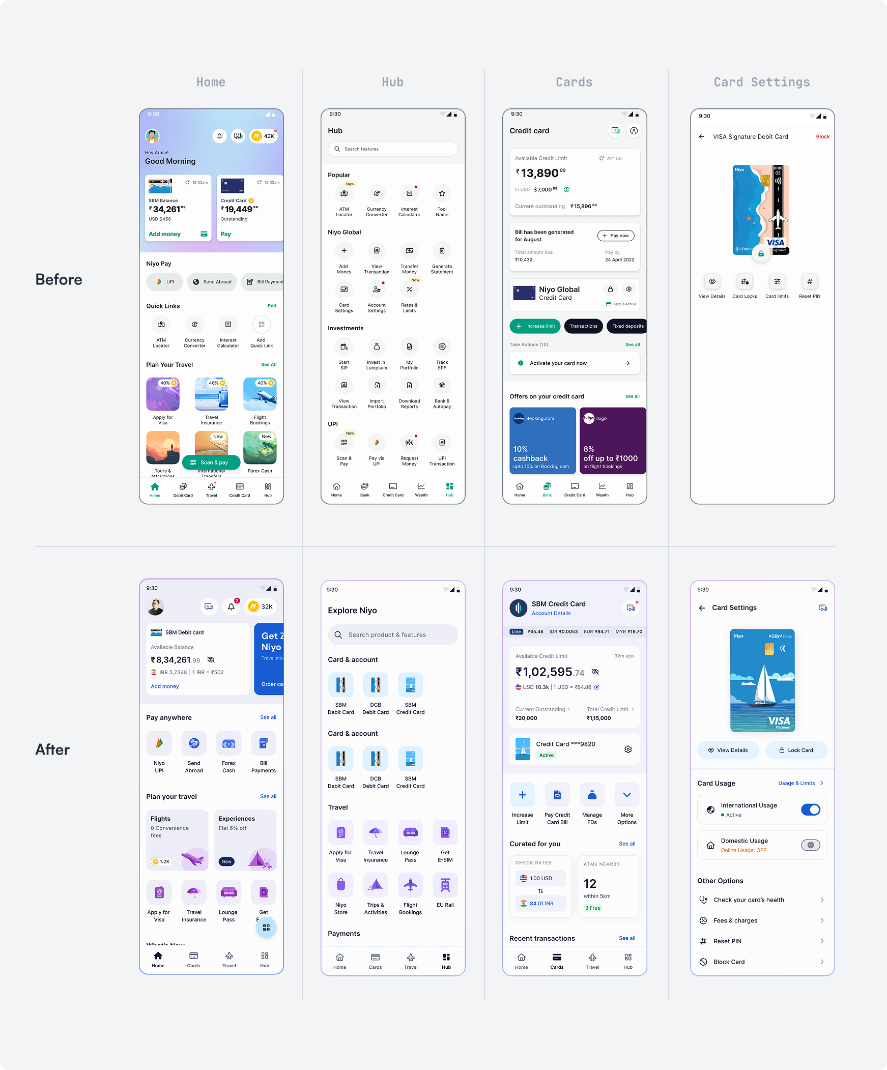
4. Design system & App revamp
Niyo's design system was limiting the company's goal of experience and expansion of offerings. A 5-year-old system — outdated visually, with accessibility issues around colors and tap areas, and not built to cover the growing use-cases that came with the company's rapidly expanding services portfolio.
Designers across different pods were making UI decisions independently of a centralized system. Most features/flows ended up looking like a standalone app or experience — more time spent in reviews, more headaches for developers maintaining different code for barely different components.
Key areas:
- A scalable design system that supports both app & web development across Niyo's 15+ offerings
- Ensuring all key experiences adopted the new design system
- Visual identity for the subscription plans
- Leading the entire design team, coordinating with engineering and leadership for a consistent experience
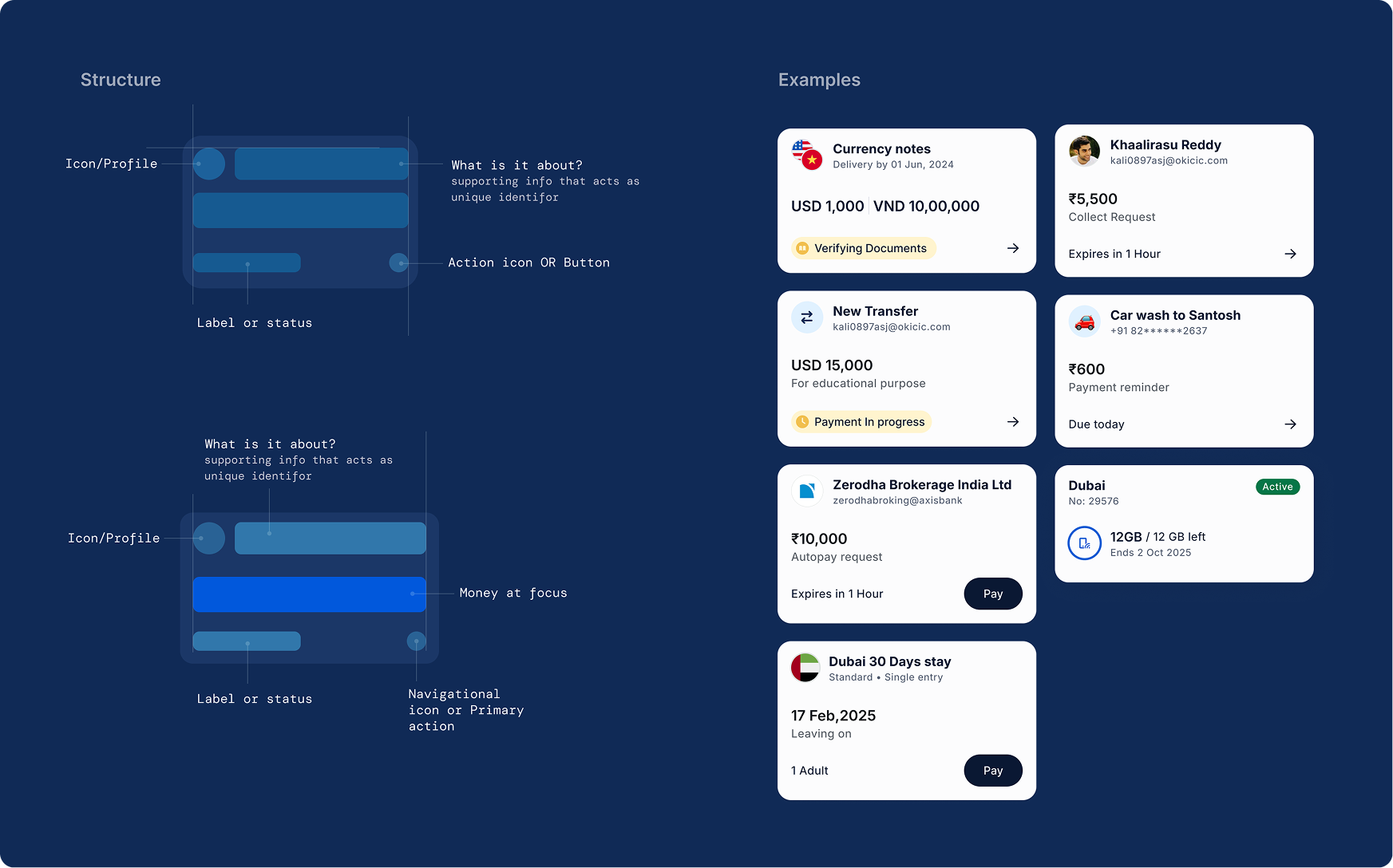
Introducing ADAPT (Accessible Design And Performance Toolkit)
As the name suggests, the core idea behind the new design system was adaptability. With different banking partners and ever-evolving financial services, the system needed to scale easily to new components and use-cases while keeping the overall experience consistent.
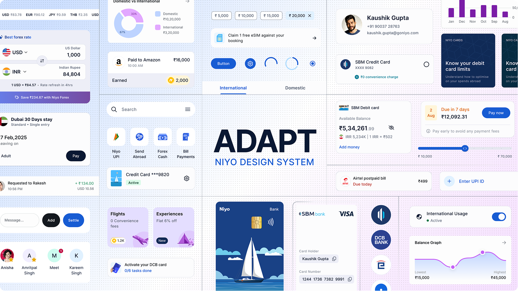
Niyo wanted to bring many of its app offerings onto the website, so the new system needed a foundation that could work smoothly across both. After multiple rounds of discussion with engineering and leadership, we decided to build on Material 3 as the base system with heavy customization — this reduced development time drastically and led to faster release cycles.
Outcomes
Impact
- Brand equity: unified visual system across marketing, web, and mobile boosted brand recall.
- WCAG compliance: 100% AA compliance on web and mobile.
- Faster cycles: component-release times down by 50%; dev handoff issues dropped 70%.
- Rapid migration: all 40+ products fully migrated within two months, zero rollbacks.
This project demonstrates how a strategic, scalability-first design system can transform brand perception and product efficiency. By combining rigorous research, accessible design principles, and cross-platform collaboration, Niyo now delivers a cohesive experience across mobile and web, prepared for future growth and innovation.
Notable mentions
Other key contributions
1. Lounge access
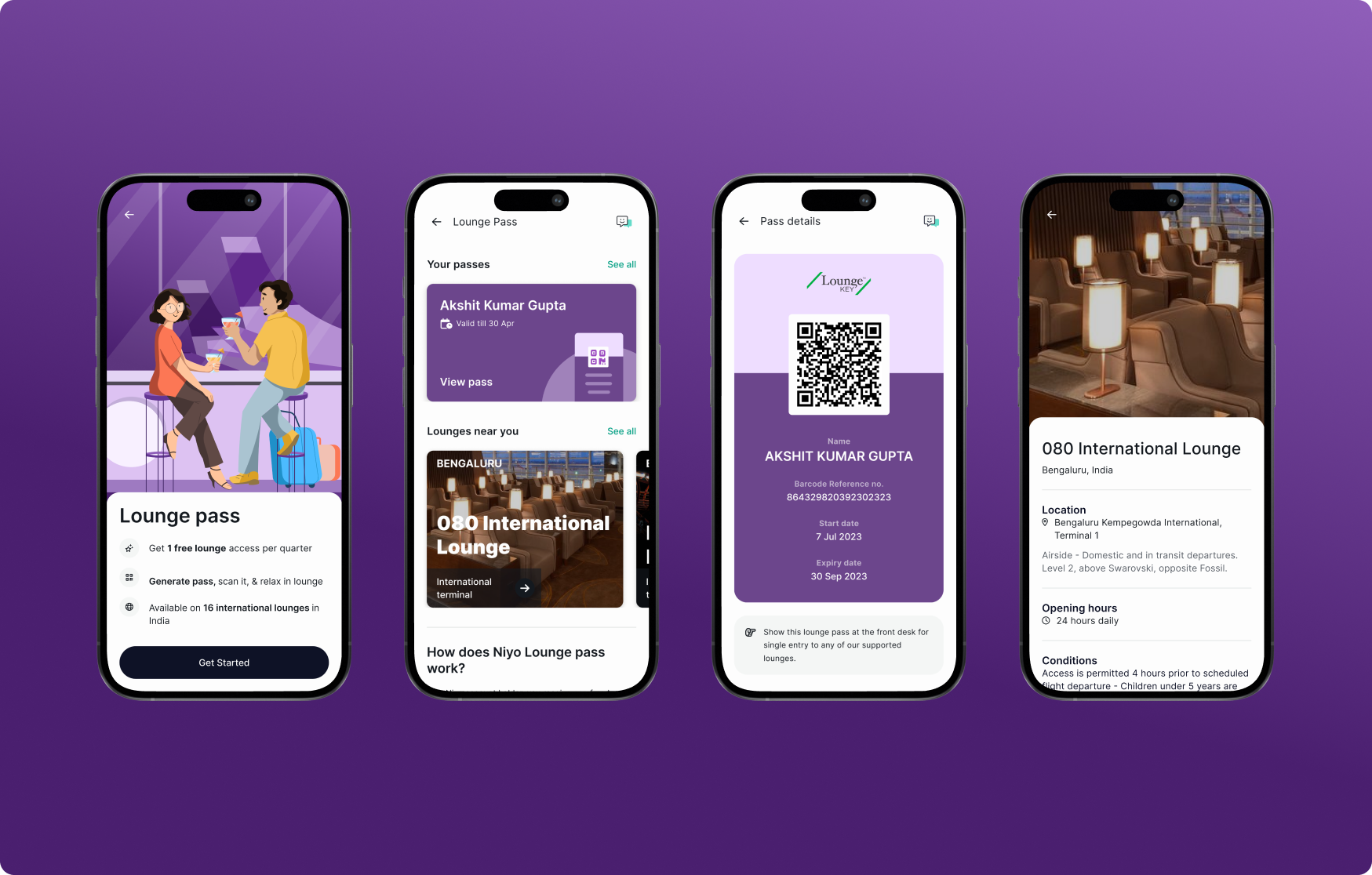
The Lounge Pass feature was designed to enhance Niyo's card adoption. With its straightforward and user-friendly experience, in the first month after launch, over 8,000 customers ordered new cards to activate their lounge pass, allowing them to bypass long queues at airport lounges.
2. Unified Transactions
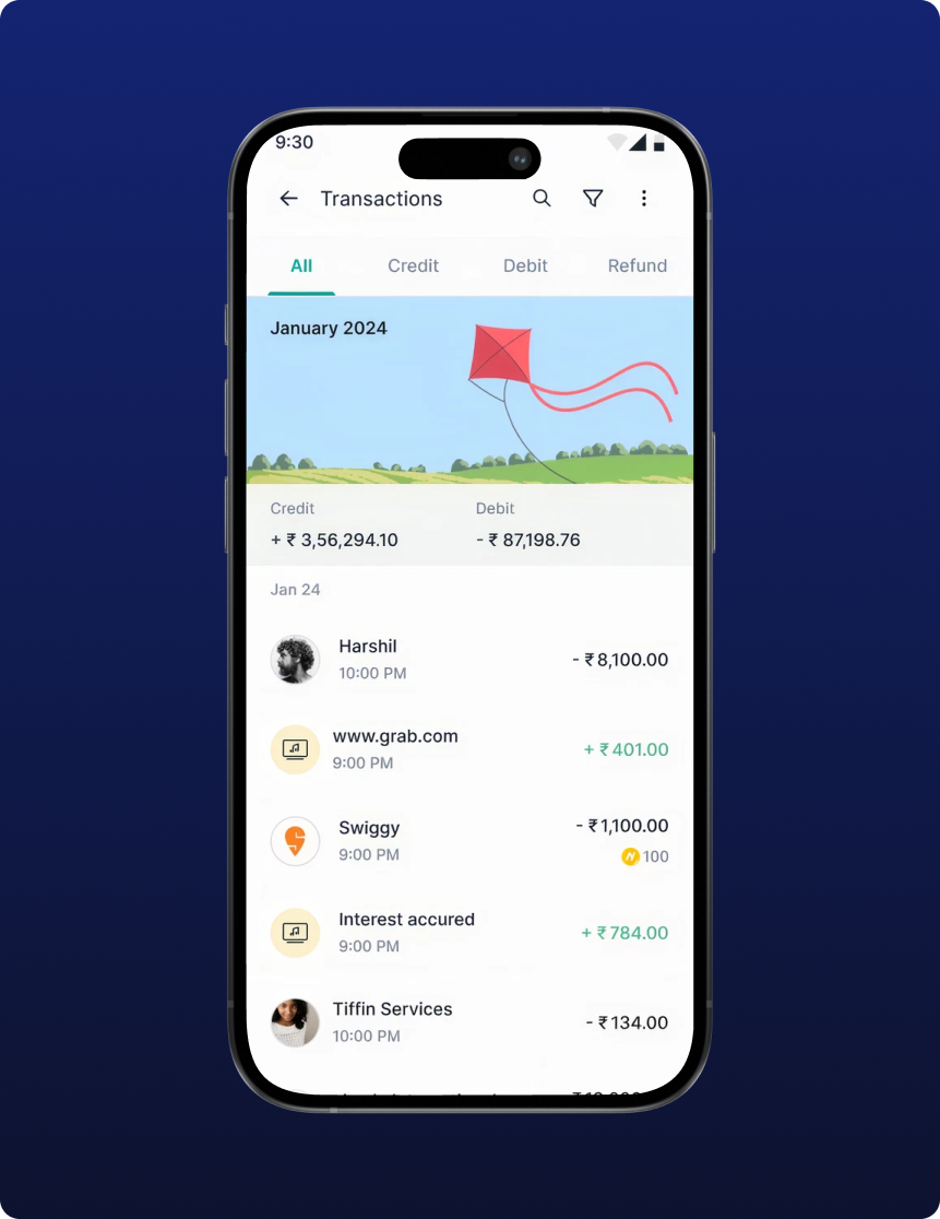
One of the most significant consistency project. Unifying the transaction system across 8+ different services. Massive time saving for design & development team.
3. Checkout experience
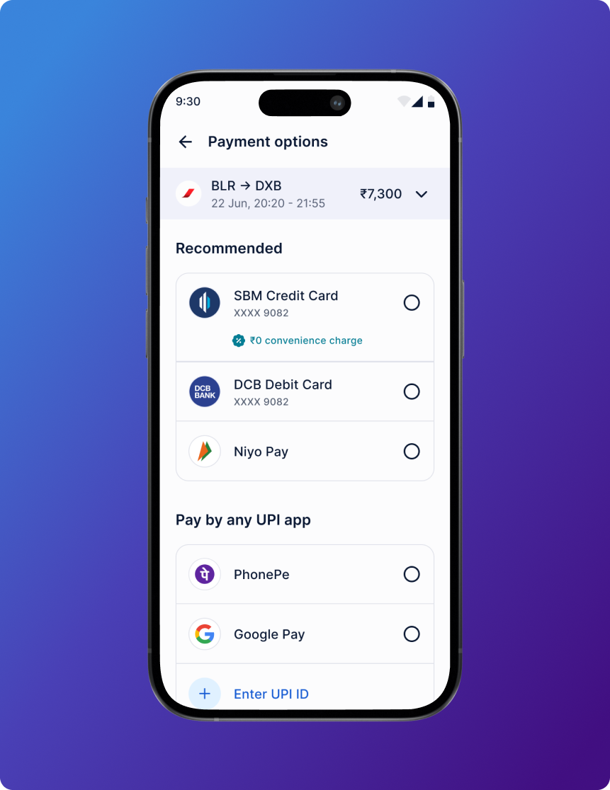
An intuitive checkout experience which provides clarity, trust and reliability to ensure high-intent users didn't stall. A scalable framework for multiple payment modes, discount offers, & faster payments.
4. Group Spends
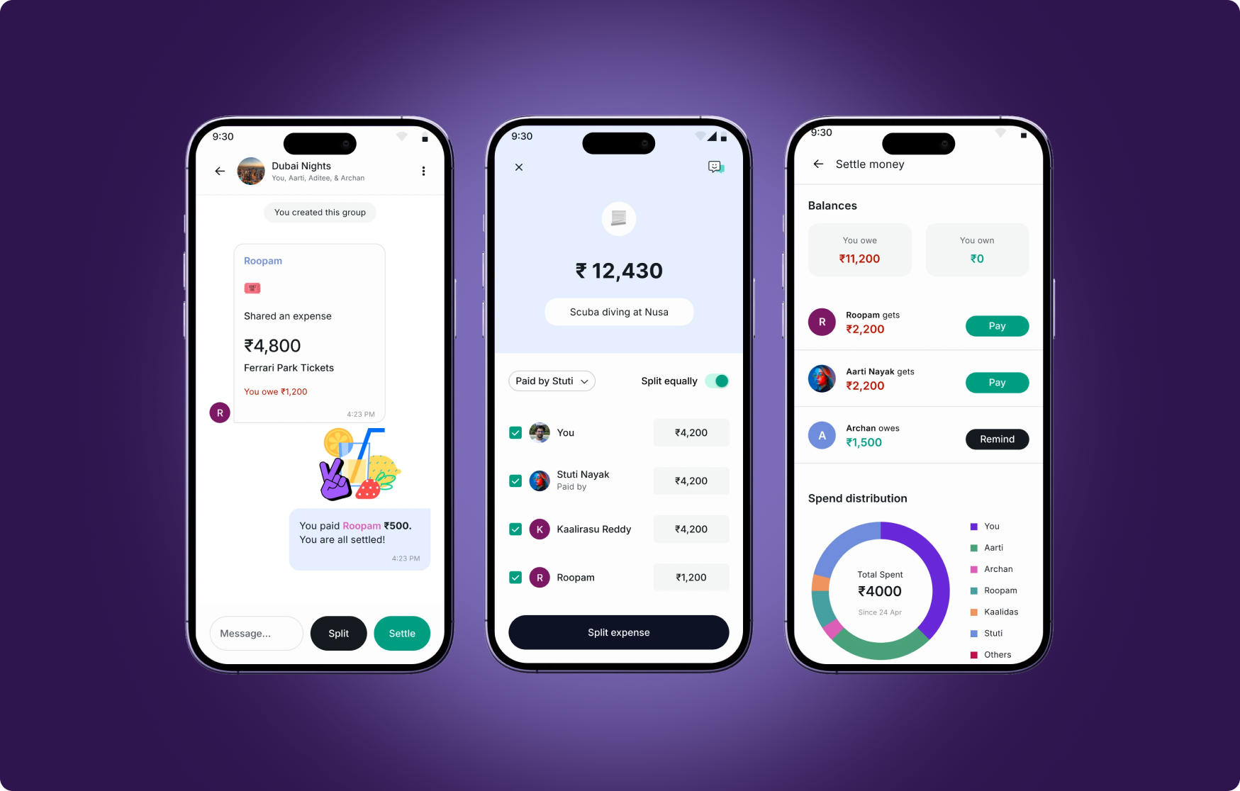
Niyo's core product empowers travelers to manage their money abroad, but many users travel in groups. A survey of over 600 users revealed that 55% travel with companions, and about 52% of those companions do not have a Niyo card. This presents a significant opportunity for Niyo to engage a broader audience. With our new feature, users can now spend, split, chat and settle expenses all within a single app, making it easier for both international and domestic trips.
5. Credit score
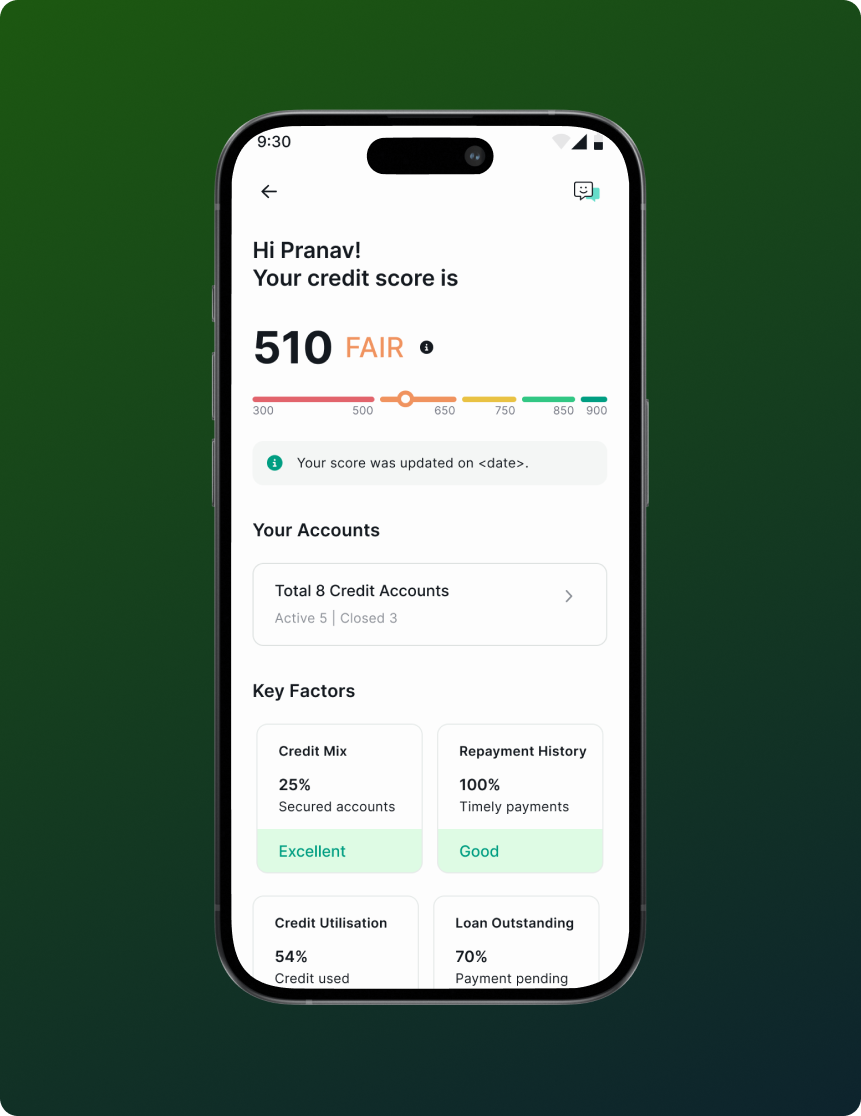
Niyo’s in-house credit score check service provides users with a quick view of key factors and repayment history, helping to understand their financial standing.
6. Spend Analyzer
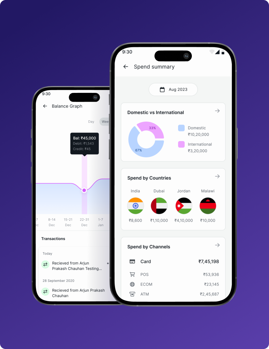
The per card/bank spend analyzer was recently launched to give users a clear, detailed overview of their own transactions across various locations, and channels.